Statistics

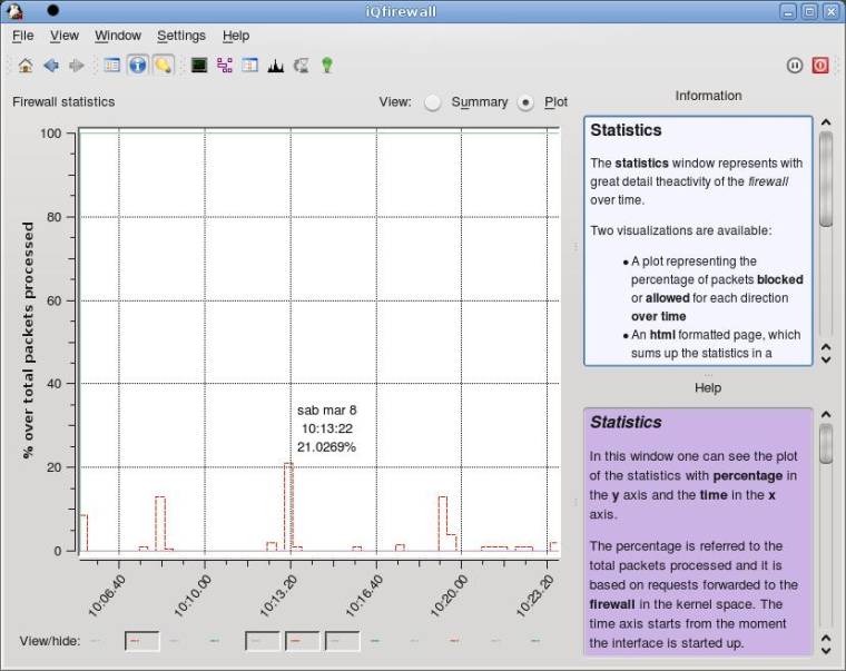
The statistics window represents with great detail the activity of the firewall over time.
Two visualizations are available:
- A plot representing the percentage of packets blocked or allowed for each direction over time
- An html formatted page, which sums up the statistics in a numeric form.
In this window one can see the plot of the statistics with percentage in the y axis and the time in the x axis.
The percentage is referred to the total packets processed and it is based on requests forwarded to the firewall in the kernel space. The time axis starts from the moment the interface is started up.
Another view is possible: click on the radio button called Summary to view an html formatted text with a summary of the statistics concerning the firewall activity.
Zooming the plot
At any point inside the plot, you can click the left button of
the mouse and hold it pressed while drawing a rectangle over
the portion of the graph you want to zoom.
When you release the mouse, the rectangular area
you selected will be zoomed.
Unzooming the plot
Simply click with the middle mouse button at any place in the plot to zoom back of one level. If you did zoom 3 times for instance, you will have to click 3 times to go back to the normal zoom (1:1).
Showing and hiding curves in the plot
In the Plot mode of the statistics window, one can
notice, in the lowest part of the widget, a series of buttons, each
representing a particular curve on the plot.
Moving the mouse over those buttons will produce
this help message to change and describe the meaning of the curve
associated with the button.
Move away the mouse from the button to view again the
global statistics window message.
Another easy way to get information about the curve represented by the button is to stop the mouse cursor over it and wait shortly for a tool tip describing the plot item. This is useful if in the future you do not want to have the help panel shown in this window.